This blog is best viewed at resolutions at least 1280 pixels wide. Anything less is for failures.

Wednesday, February 28, 2007

Video Games & Narrative

Ah, right up my alley.

Henry Jenkins' article discussing video games and the stories they tell coincides nicely with another article published on Monday that became a subject of discussion over on Slashdot. Jenkins introduces us to the Ludologists and the Narratologists, who are in a conflict over what the focus should be in a game: its mechanics or its storytelling. This conflict makes it seem as if the two are mutually exclusive or that games would be better if they were. I've played many games that are excellent in combining the two, so to me this conflict is a bunch of nonsense.


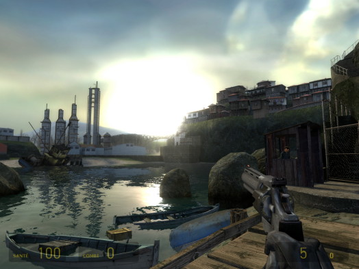
Jenkins mentions the Half-Life series briefly, and to me this game is a prime example of blending story with gameplay. While some games are obsessed with using cut-scenes and other traditional forms of storytelling (a "feature" one game design lecturer I regularly listen in on despises, telling us that if he wanted to watch a movie, he'd go watch a movie), Half-Life, as Jenkins puts it, is "empty" of those "contemporary narrative activities". While Valve, Half-Life's developer, does not underestimate the importance of a good plotline (see Marc Laidlaw), it also knows that a game is to be fun, and if its 50+ game of the year awards mean anything, they certainly delivered in that department. Half-Life's world isn't spoon-fed to you. It's simply there. However, there are definitely enough clues in the game so that the entire plot of the series can be pieced together, very little of which is directly told to the player.

One of the most astonishing examples of piecing together a storyline, though, is that done in part six of a retrospective dedicated to the Legend of Zelda series.

Although Nintendo has made over a dozen Zelda games (which, since they are more on the role-playing side, rely on traditional storytelling methods), there is little to no explanation as to how each title is connected, much less the order in which each game is placed on a timeline. After carefully scrutinizing every event in each these games, a jaw-dropping split-time theory has emerged that fits seamlessly, relying on the ending of what many people consider to be the best game ever, The Legend of Zelda: Ocarina of Time for the Nintendo 64. The storyline in that game alone made me take a picture of the TV when I finally beat it. Sadly, I don't have that picture anymore, so a video explaining the split timeline theory will have to do.


So uh, yeah. Games can definitely achieve a perfect balance between story and gameplay. The thing about games, though, and the reason I think people have begun to value the plots in games less and less, is that they're not movies or books. Games are interactive, so their storylines must be as well. Forcing plot down a gamer's throat removes that interactivity. Some games have tried to work around this issue by making the plot twist around the player's moral decisions, but often things still feel too linear.

We gamers are smart. Build us a universe and a story, but don't spoil either. If your story is interesting, we will go out of the way to learn more about it. Provided you thought everything through ahead of time and constructed your game correctly, we should be able to figure everything out for ourselves.

Wednesday, February 14, 2007

Spectatorship, Power and Knowledge

Above is a blueprint for Jeremy Bentham's Panopticon, a concept originally designed to be implemented in prisons. A Panopticon prison operates under the principle that since we behave when the authorities are watching, we will continue to behave so long as we believe we are still being watched. Therefore, a cylindrical prison with a guard tower in the middle will produce the same effect provided that the prisoners are not able to see if there is anyone in the tower to watch them.

The Panopticon principle applies to various other situations as well including, as John points out with Tabatabainejad's taser-induced dramatics over at UCLA, against the authorities themselves now that camera phones are everywhere. The whole world better be on its best behavior now; there's just too great a chance that the instant you lose your cool there will be someone there to catch it and post it on YouTube.


Tabatabainejad gets tabatabatasered

This whole Panopticon thing reminds me of an experiment from a while back that I unfortunately cannot refind: basically, a coffee shop was losing a considerable amount of money because no one paid when they used the self-serve thermos pump thingies despite the sign nearby with a list of prices. Apparently, all the owner had to do was include a pair of eyes to the sign and people were much more likely to pay up for the coffee they were drinking. This concept can also be used when creating "please take one candy" signs for Halloween.


Interestingly enough, the word Panopticon comes from all (pan-) and observe (-opticon) , or all-seeing. Can you think of anyone who sees everything and wants you to be good?

Close, but no blunt; I'm talking about God. Religion is the ultimate Panopticon: there's some invisible dude in the sky that sees everything you do, so you better play nice. Even though the threat of eternal damnation in Hell is there, the real reason to behave is to not feel the disapproving stare of an entity that exists in the exact same way a fiat dollar is worth something.

Whatever happened to behaving for the sake of behaving?

Wednesday, February 7, 2007

Still Image Assignment

Part One: Kruger

I'm not required to blog about this one, but I will anyway if for whatever reason I miss anything when I get called up to “articulate [my] own goals for the image [I] create[d]”. Here’s the finished product—no point in posting the original, not in this case at least:


Basically I took the H-Bomb Image and added to it some jargon in the visual style of Barbara Kruger. In case you are more of a Mac person, the text translates to a series of keyboard shortcuts that are shared by most PC applications. In order, they translate to Select All, Delete, Save, and Quit. This (and, of course, knowledge of Barbara Kruger’s work and the ability to recognize the image as that of an H-bomb, both of which everyone in this course is familiar with) is all that’s necessary to begin interpreting my work. The rest could all hopefully be inferred by the viewer; so take a moment to overanalyze my image real quick like we’ve all had to overanalyze various texts in high school English class because I’m about to spoil it all as soon as I finish typing this sentence right about...now!

First off, I hoped my viewers could make the connection between the PC application commands and what a weapon of mass destruction does—that is, Select All and Delete. Once they’ve figured out that the first two steps apply to both PCs and real life, they would move on to the last two steps. This part’s a little trickier, as they’d have to figure out that once one saves and quits, he can no longer undo.

[This was a concept I chose to not state outright, as I felt that would give too much away. I also considered adding a fifth block of text with the ctrl+z Undo command (or even f12 for Photoshop’s Revert command) crossed out, but I don’t remember seeing any Kruger images with crossed-out text and did not want to deviate from her visual style.]

After figuring this out, they’d begin to ponder the results of creating and detonating weapons of mass destruction. If I were to ctrl+a, del, ctrl+s, and alt+f4 right now, I’d effectively lose the entire blog post I’ve worked on so far as I am typing all of this in Word. Not only that, but no matter how much time I could try and spend retyping everything, the reproduction just wouldn’t be the same—I’d forget some ideas, or at the very least the wording would change slightly. This is true for WMDs as well. You could nuke even an uninhabited area and millions of man-hours later you still would not have reverted it to its original state. This lack of undo also applies to the world as a whole: since the development of nuclear weapons, the planet could be destroyed with the push of a button, and this is an irreversible fact whose consequences we have to deal with for the rest of our lives.

A few more things to think about:

1. The blocks of text are all lined up and numbered. This structure hints at a list of instructions, or in this case, a recipe for disaster.

2. The irony of how something technical like computer jargon could apply to something so human like the potential deaths of millions.

3. The del text serves as a euphemism for wiping out an entire paper just like the military uses euphemisms for many of their violent acts. The sudden change in font size is to point out how small words like del or h-bomb can make a large impact and therefore are bigger than they seem.

Part Two: Punctum

When I was digging through the images looking for something cool to do with them, I could not stop thinking about how the eyebrows of the left-most guy in this image...

...looks almost exactly like the eyebrows of the girl in this image:After laughing uncontrollably for ten minutes, here’s what I came up with:After laughing uncontrollably for another ten minutes, I started figuring out why I liked it so much: the best part, I think, is how the woman went out of her way to make herself up, yet the end result on a real woman is no better than an attempt by a man trying to pass himself off as one.

I’m nowhere near pro at Photoshop, so I’m quite happy with the way it turned out. It’s not even close to being perfect, but I’m at the level that if a moderately intelligent person who has never seen either of the originals before needs more than one good look to be 100% sure the image has been Photoshopped, I’m satisfied.

Since The Americans came out in the 50s, it’s safe to assume that the idea of interracial relationships were taboo when this picture was taken. I just took the controversy one step further by changing the relationship into a homosexual one. People are still uncomfortable about that these days, so I can only imagine how the reaction to my picture would’ve been if it were real.

Part Three: Sign Systems

Imagine the eight million people that subscribe to the MMORPG World of Warcraft. Now picture all the people who have practically lost someone they care about because that person spends all their time playing it. What if these family members all pitched in a few dollars each and hired the world’s best hacker to design a worm that made it seem as if leaflets rained down from the Zeppelins that transport players between continents? What would the leaflets look like?

Here’s the source of my parody:
And here's the leaflet, front:
And back:

The leaflets closely resemble the original, right down to the careless pasting of images, text similar to WordArt, and overall craptasticness. To help convince the addicts to quit, I put part of my argument in terms only they truly understand: item statistics. By presenting them with a piece of Rare (blue-text) armor and a piece of Epic (purple-text, worth more and usually better) armor, the addict will obviously prefer the superior True Love item. However, this “item” is obviously fake and requires the addicts to reestablish a connection with their loved ones, most likely by cancelling their WoW subscriptions.

Indices:
- Photographs are indexical.
- The woman’s frown is indexical proof that the lack of attention from her WoW-addicted loved one makes her sad.
- The reverse is true for the happy family.

Icon
- The images of the two items resemble the items they represent.

Symbol
- The high-level, fully decked-out character is a symbol of an excessive amount of time playing World of Warcraft.